
Design systems
Stadia
Roles
UX Design Manager
Staff Visual Design Lead
About
A pioneer in cloud gaming tech, Stadia’s promise is the freedom to play your games on any screen you own. Our challenge was to create an adaptive design system that scaled to all screen sizes and input devices. As a UX Manager and Staff Visual Design Lead for Stadia, I oversaw the creation and maintenance of our design system with a team of visual and interaction designers, UX engineers, and software engineers.
Shift towards a Unified Design System
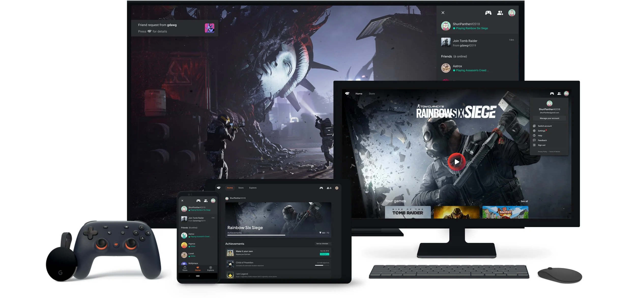
Originally designed as a living room first experience for launch, Stadia was created using 3 separate design libraries across mobile, web, and TV. While this approach had its advantages in optimizing for device specific interactions, it meant design and engineering teams had to maintain separate component libraries and code bases. This created a lot of overhead maintenance, and feature parity across devices was difficult to maintain. Designers would often get bogged down on needing to create multiple designs for new features, and engineers would be strapped for resources in order to make simple updates. Through user research, we found that Stadia’s primary draw was the flexibility of being able to switch gameplay to any device seamlessly. However, players often became disoriented when switching between form factors because of inconsistent features and presentation.
Separate design systems for mobile, web, and TV led to design inconsistencies
As a result (and as web became the primary medium to reach as many devices as possible), we knew we needed to shift towards a more scalable and unified design approach. Our goal was to increase operational efficiency across feature launches, future-proof surface expansion, and most importantly, maintain end-user consistency.
Consider the following scenario: a Stadia user starts playing on their phone using a native touch controller, then switches to a laptop with a mouse and keyboard, and finally moves to a TV with a 3rd party Bluetooth-connected controller. How might we design an adaptive platform that accommodates an ever-expanding combination of screens and inputs, while maintaining a consistent user experience? This challenge became our focal point.
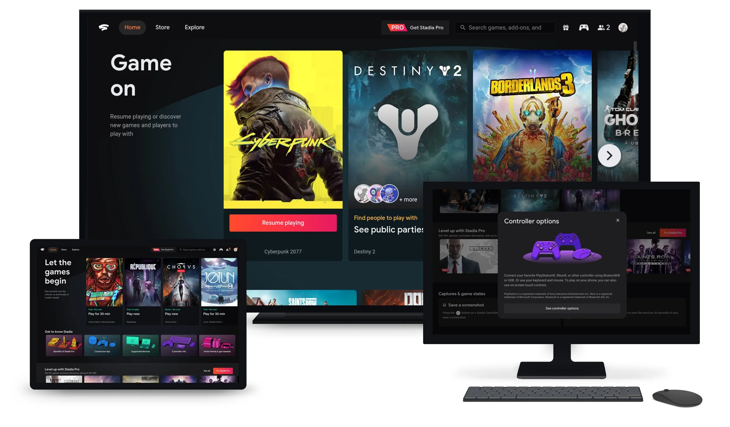
As a UX led initiative, a new, unified design system laid the foundation for a single Stadia experience, and was the primary lens through which new features were designed and built. In my role, I supported a team of visual and interaction designers, along with UX engineers, to develop a comprehensive atomic design system that covered mobile, web, and TV surfaces. This approach significantly simplified design and code maintenance, enabling feature parity across all surfaces on day 1.
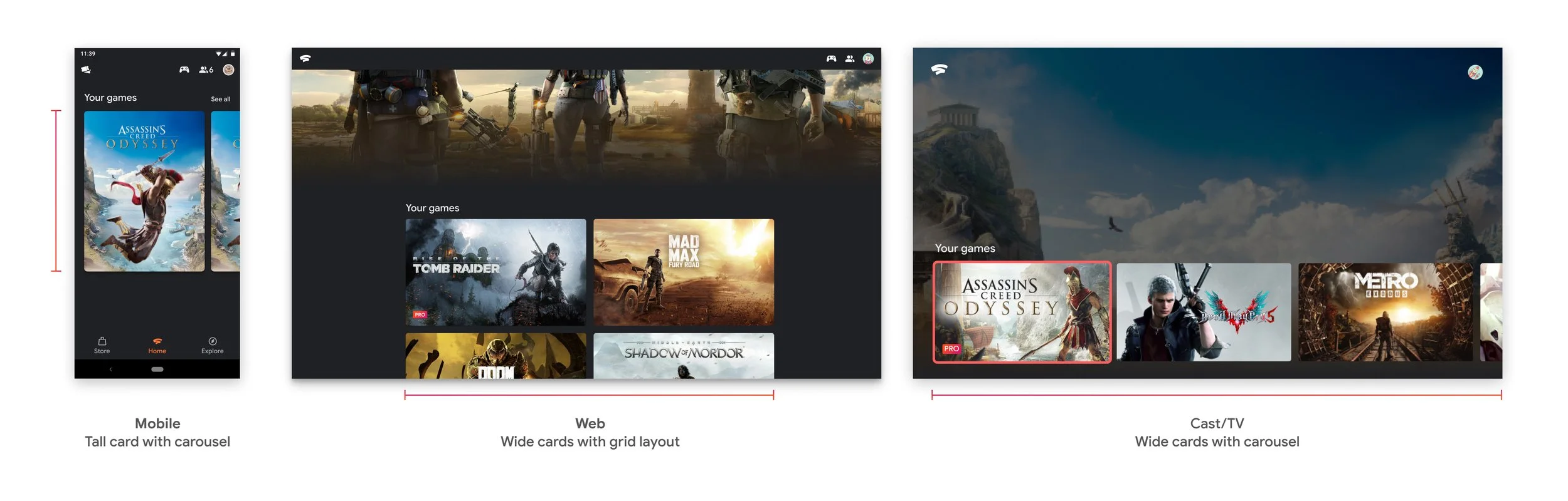
Shift to adaptive UI for all screen sizes and inputs
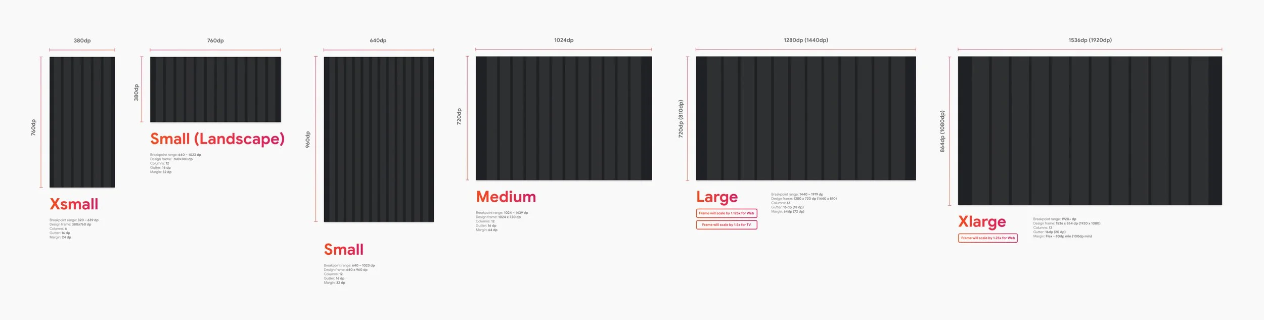
Design frames for UX design team
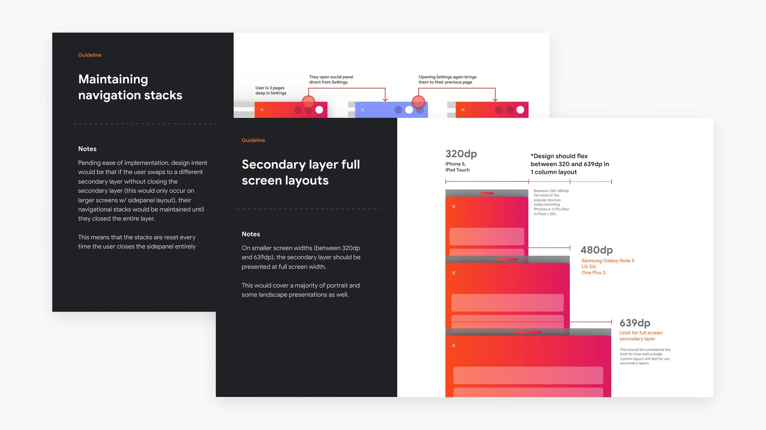
Utilizing adaptive design tools was an important part of moving towards a unified design system. As part of a comprehensive Figma design system library, we created componentized design frames along with responsive and scaling rules. This approach significantly expedited the workflow for designers and established a shared understanding of how key screens should adapt across various surfaces. This also helped our cross-functional product and engineering teams to quickly understand how components should respond. This design system served as a foundation for the platform and Stadia.com, but was also incorporated across many product areas such as Google Play, Google TV OS, and Google Material.
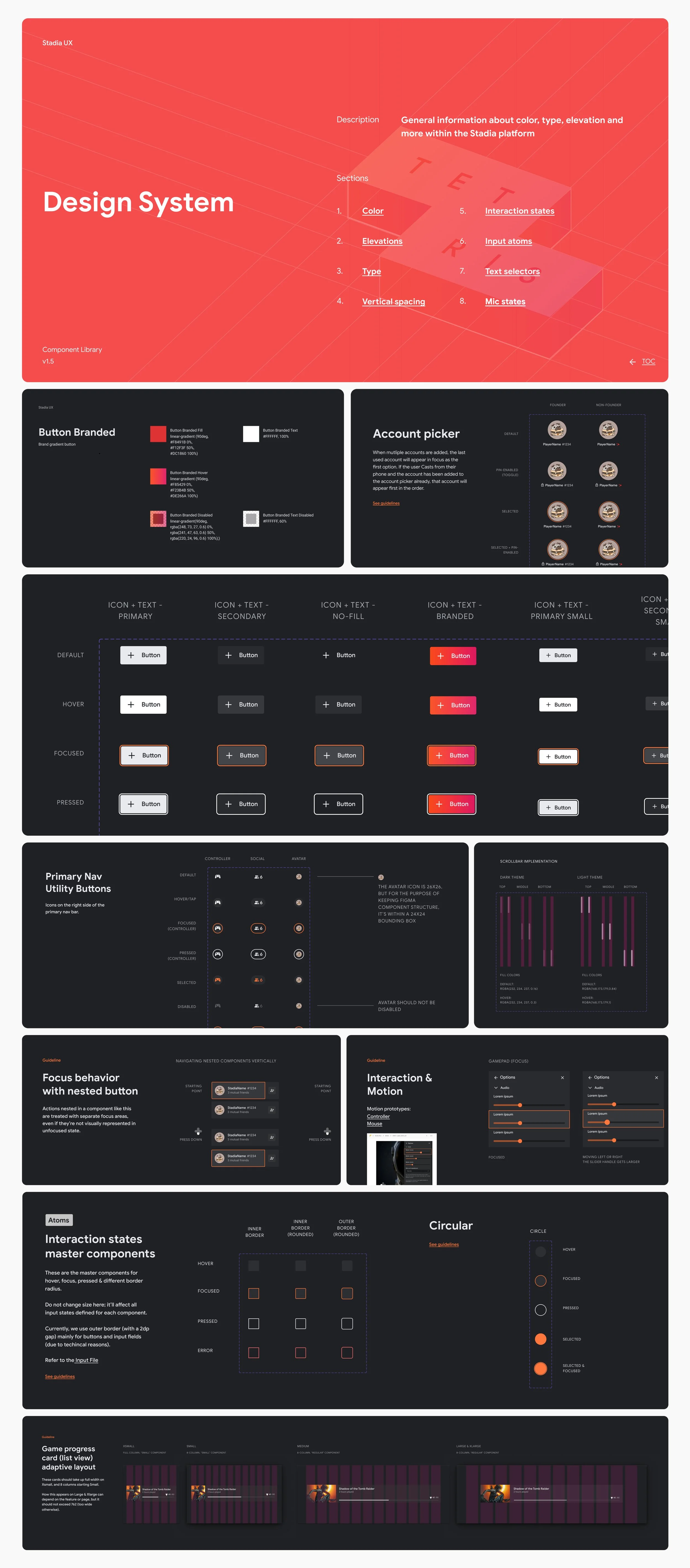
Adaptive, atomic design system in Figma with in-depth documentation and guidelines
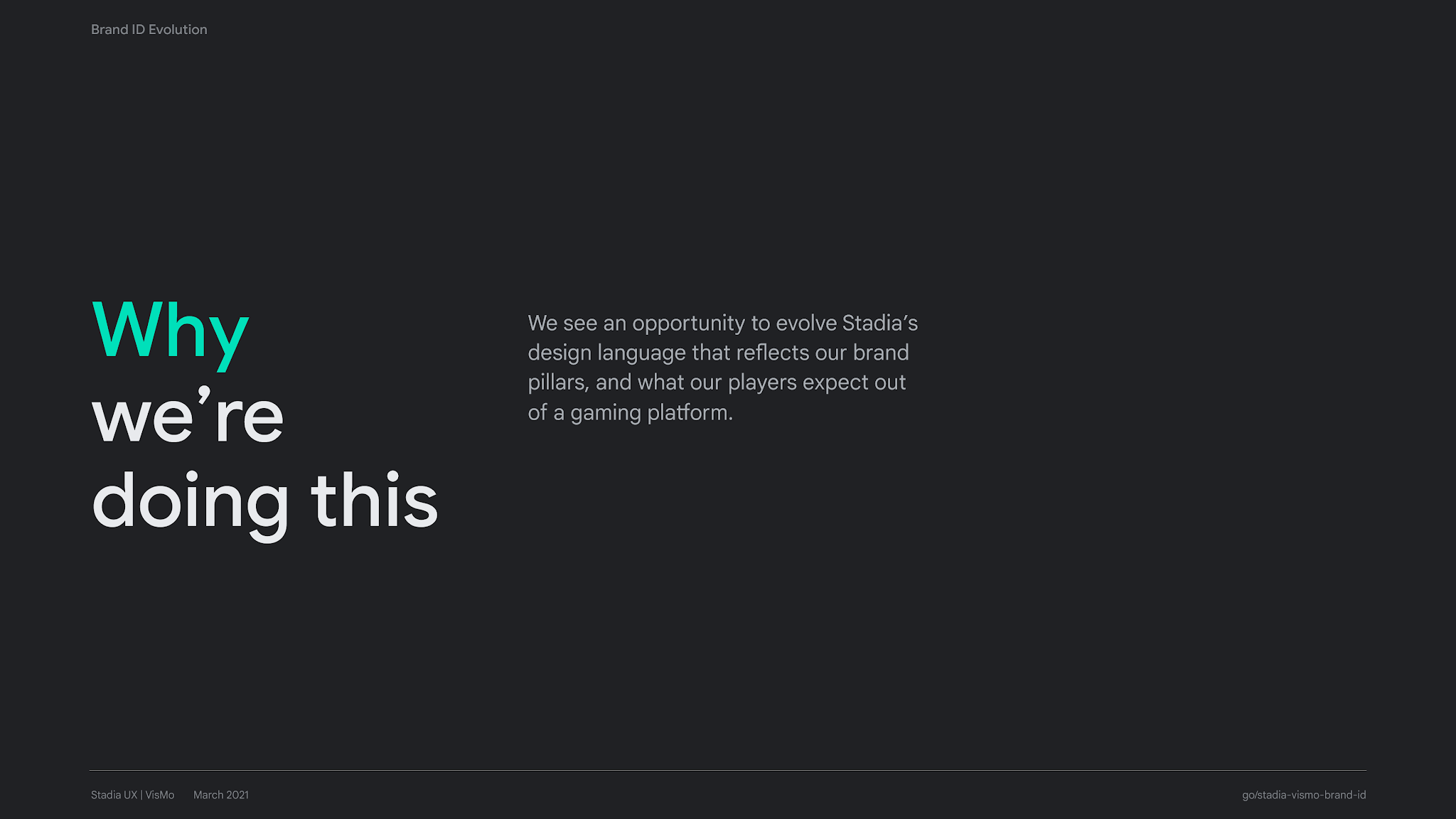
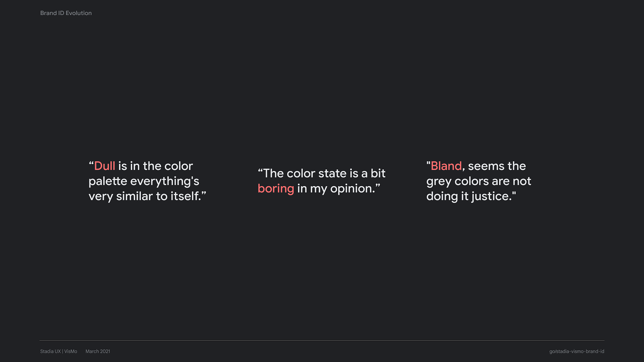
Brand Identity Evolution
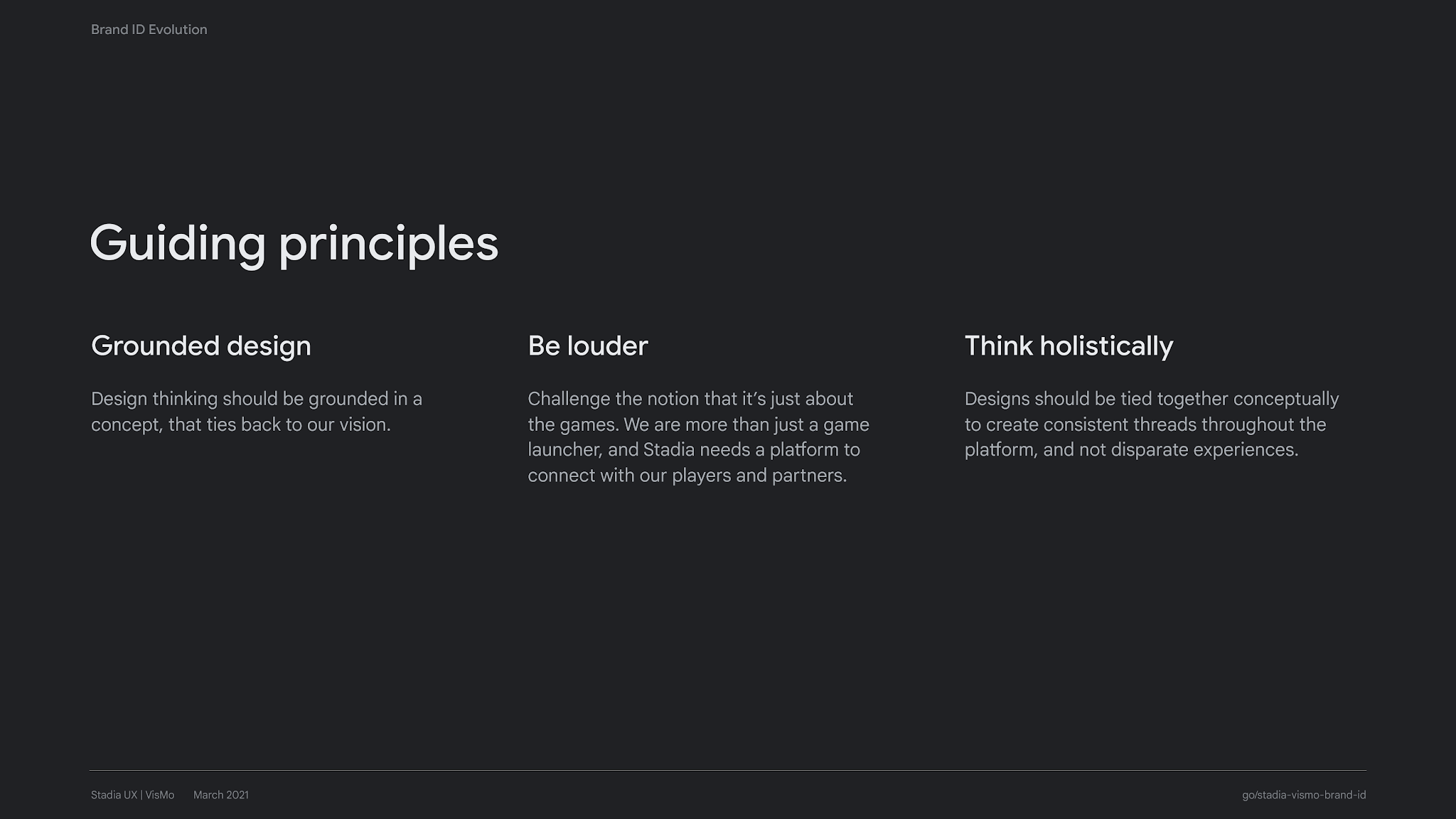
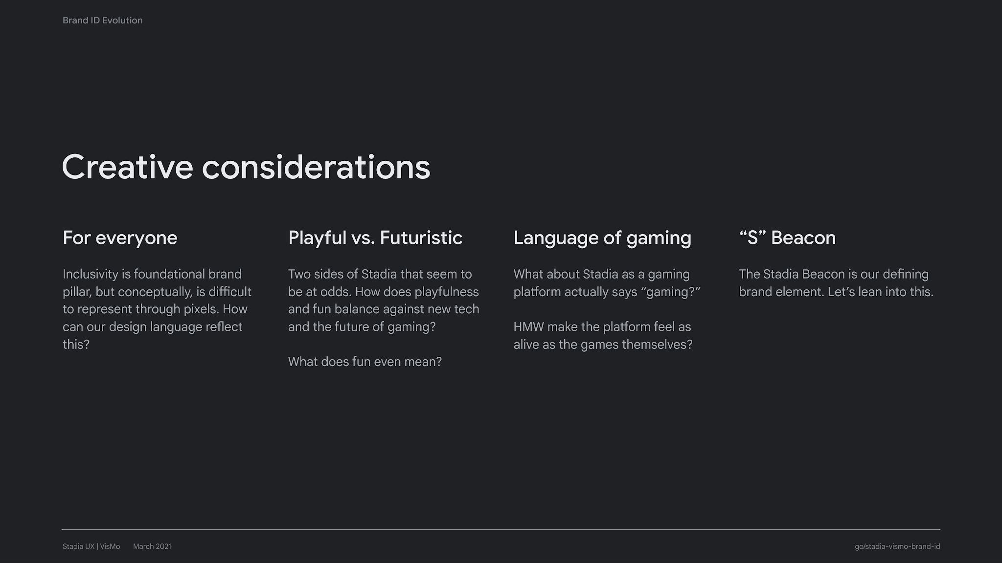
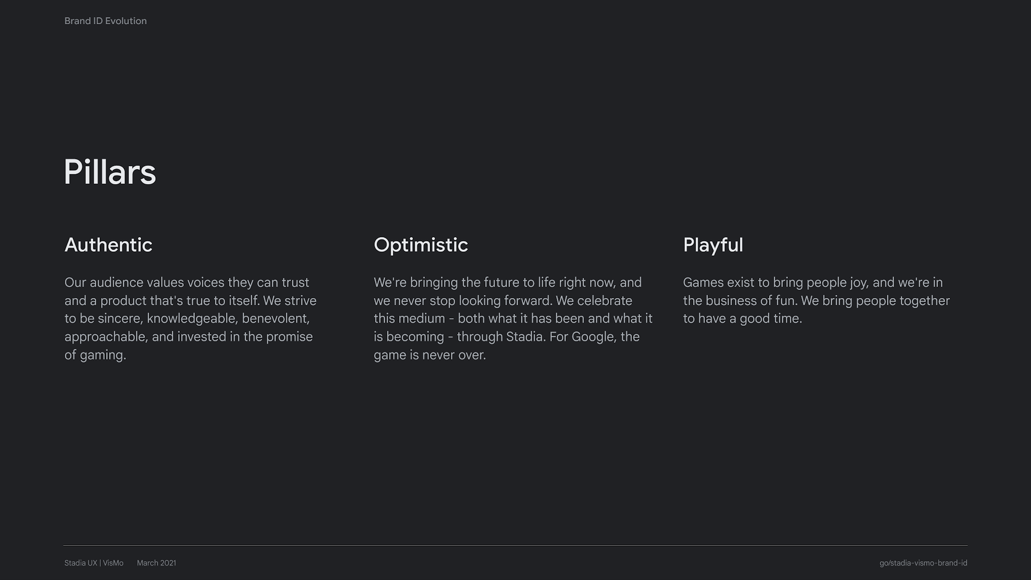
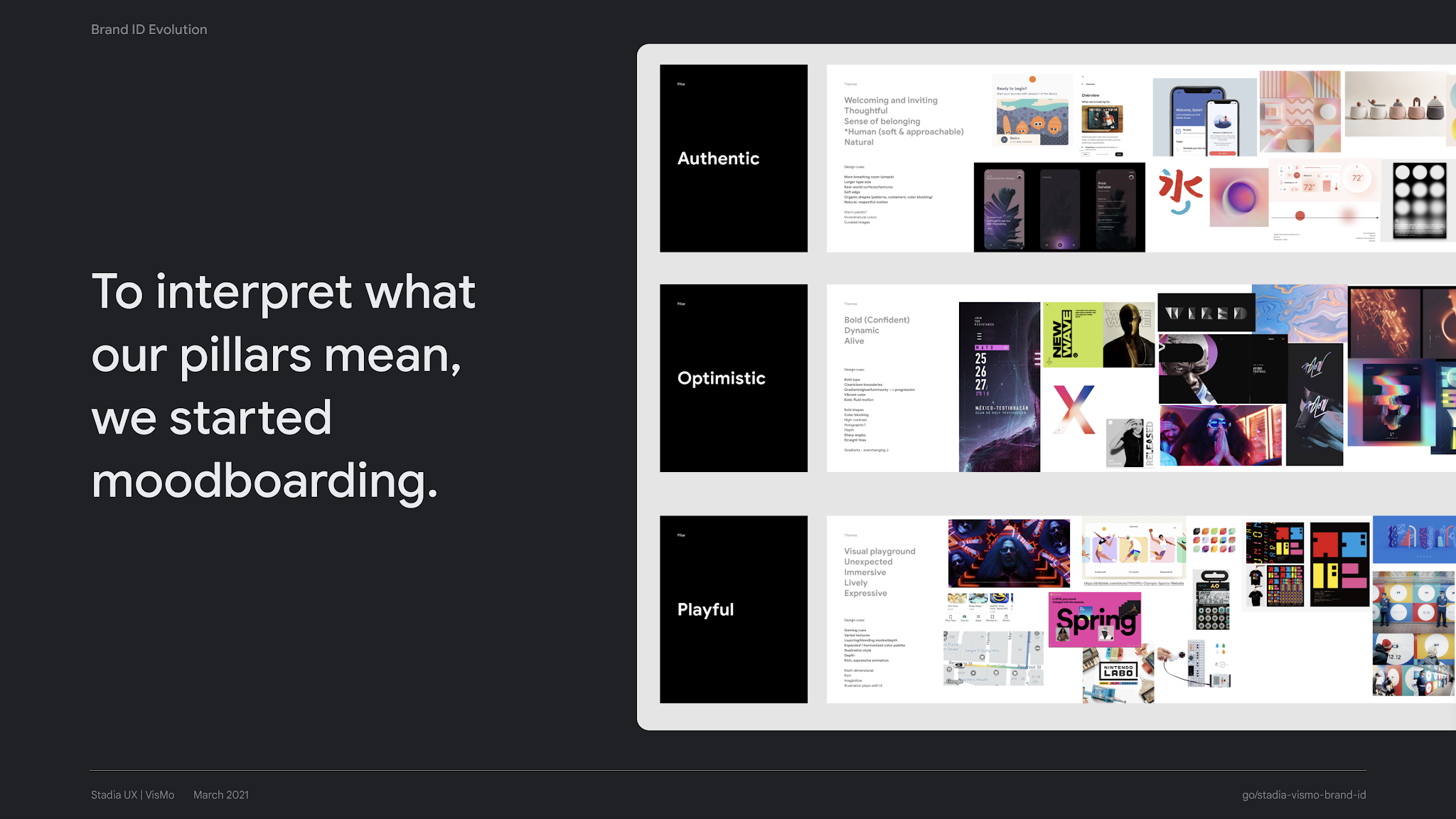
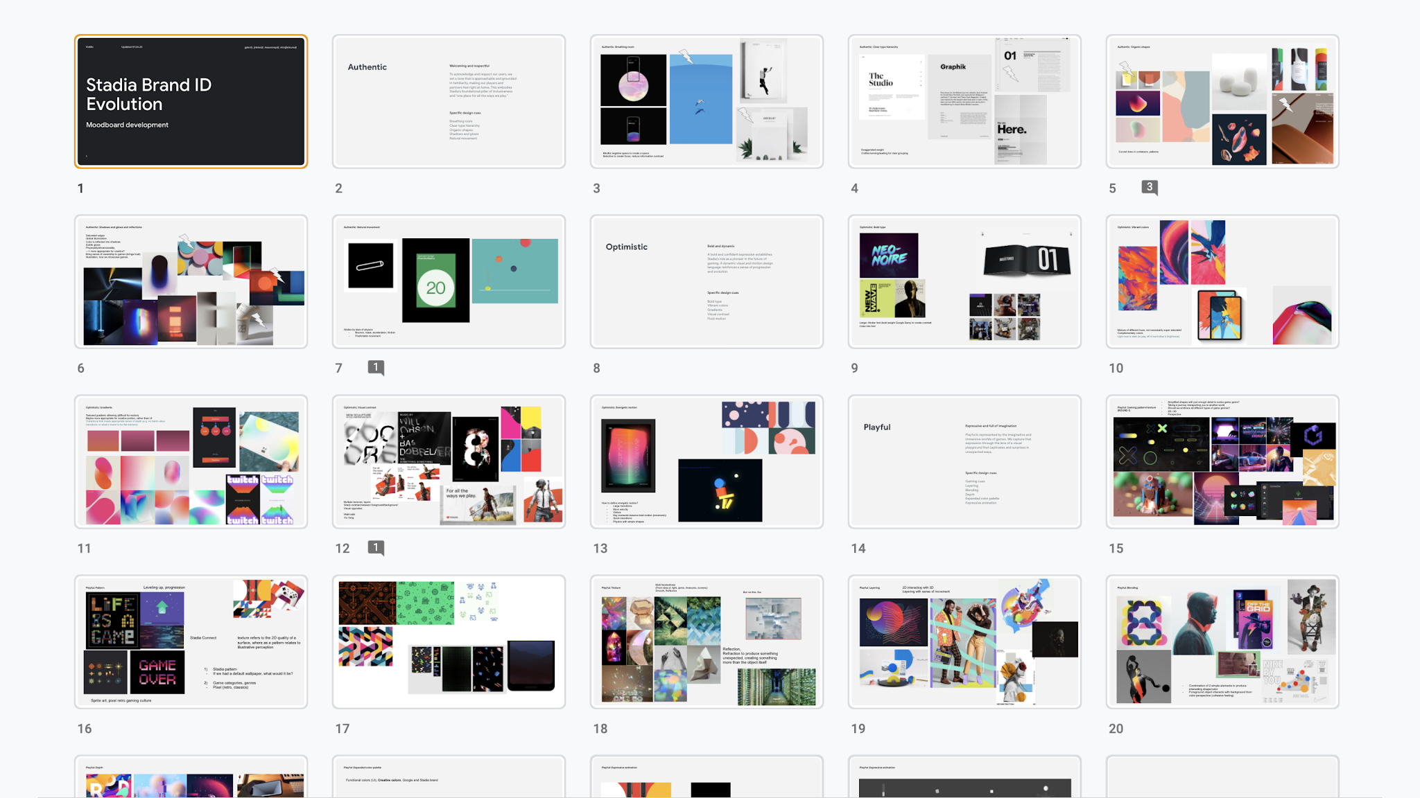
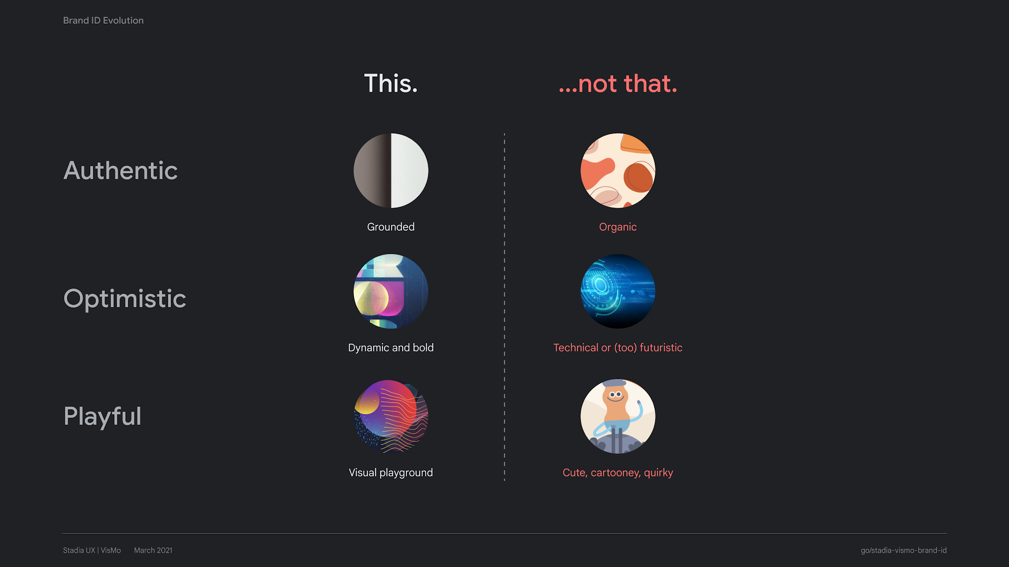
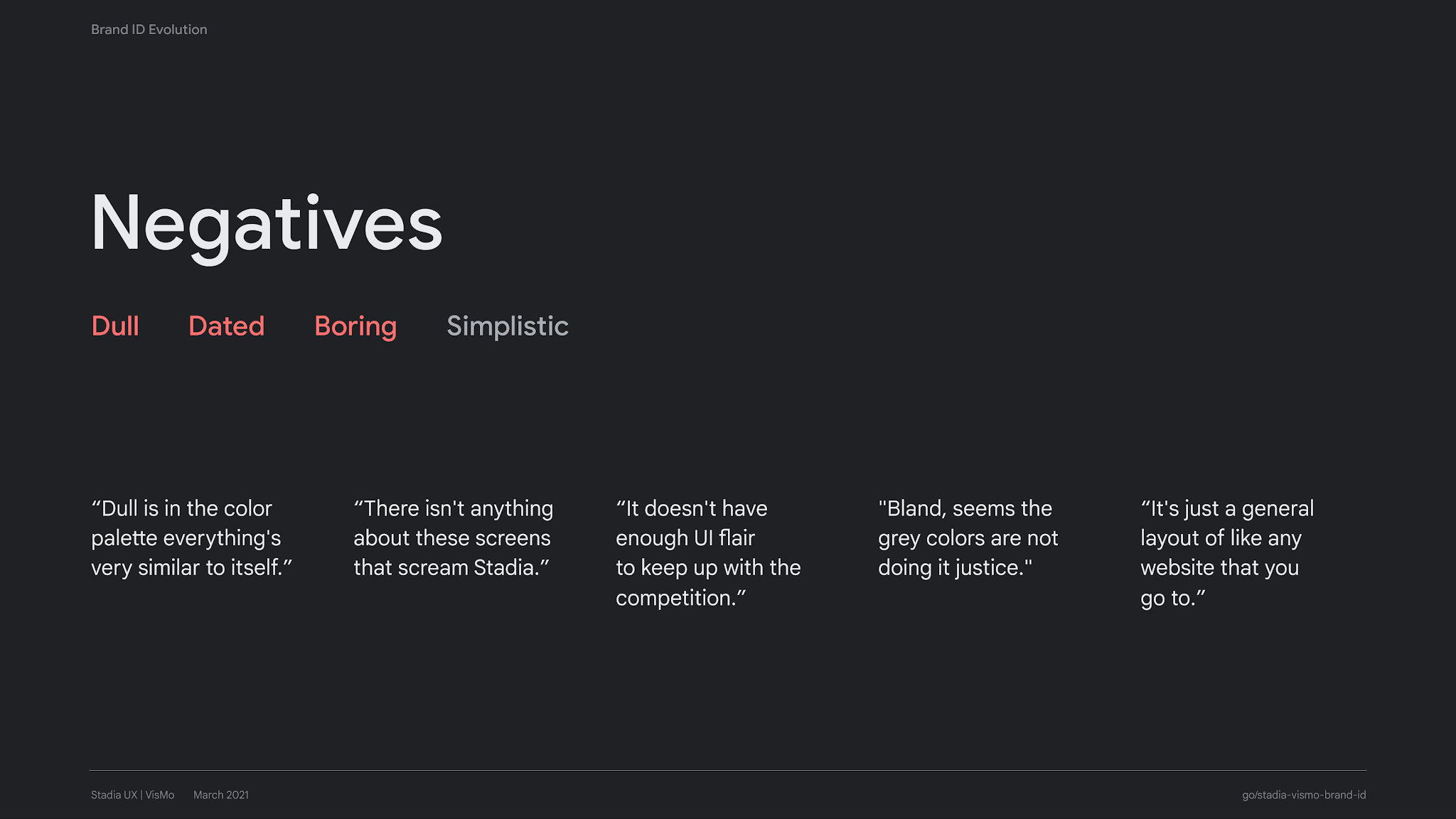
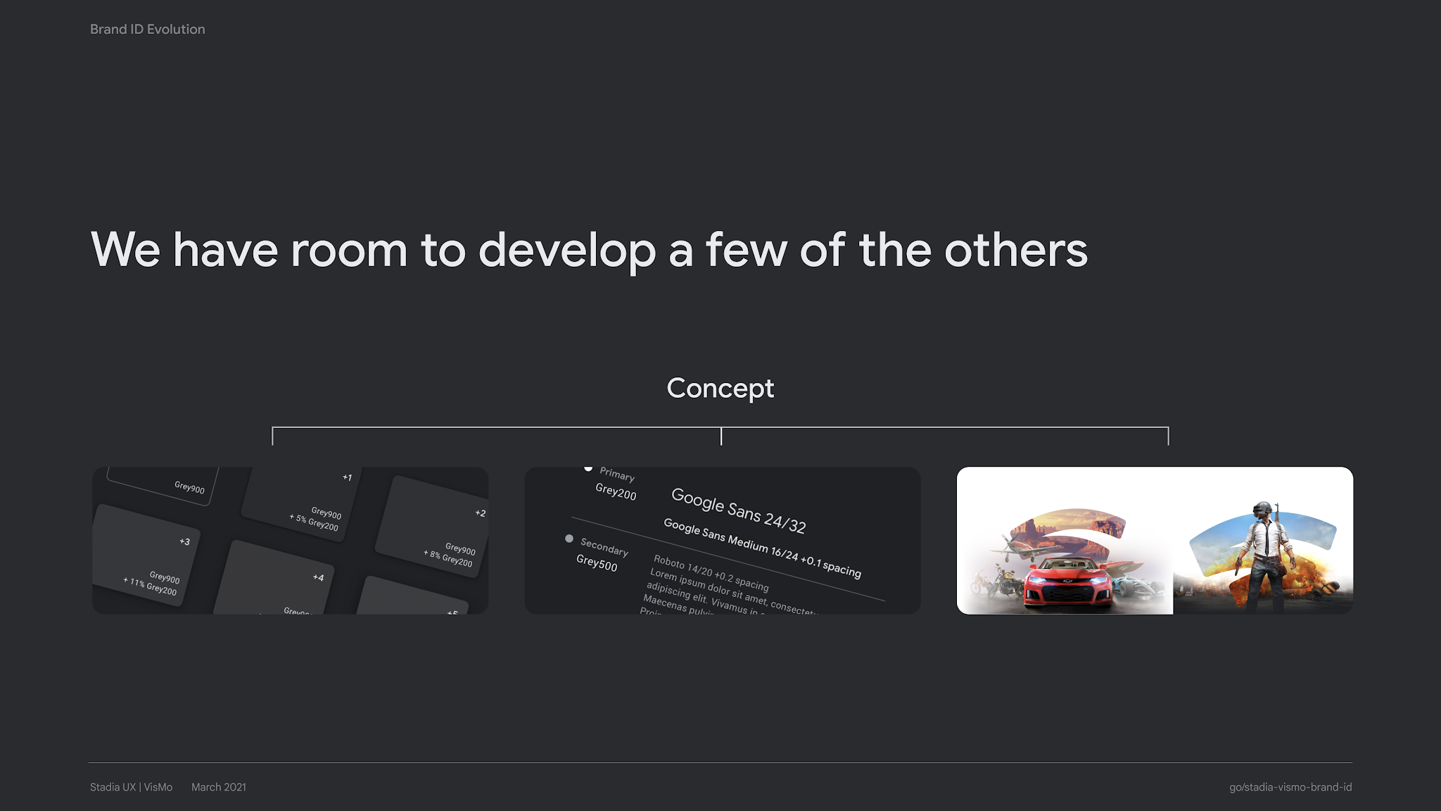
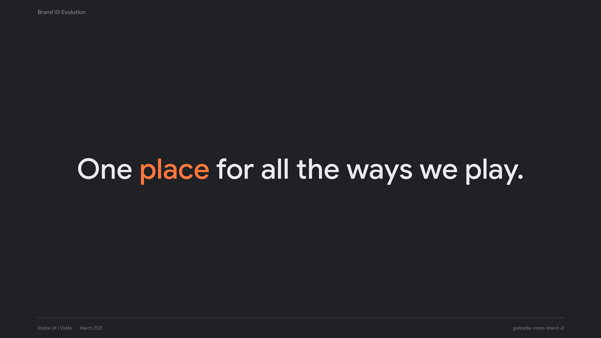
As Staff Visual Design Lead, a key responsibility of mine was to advance the design language of Stadia. In conjunction with the unified design system (above), I led a 4-month sprint with the design system team to reimagine Stadia’s brand identity, and its role in the broader Google ecosystem. This included collaboration with UXR, where we conducted user research to measure gamers’ aesthetic preferences using desirability methodologies. These insights, combined with Stadia's brand pillars, served as the guiding principles for our vision of a design refresh.
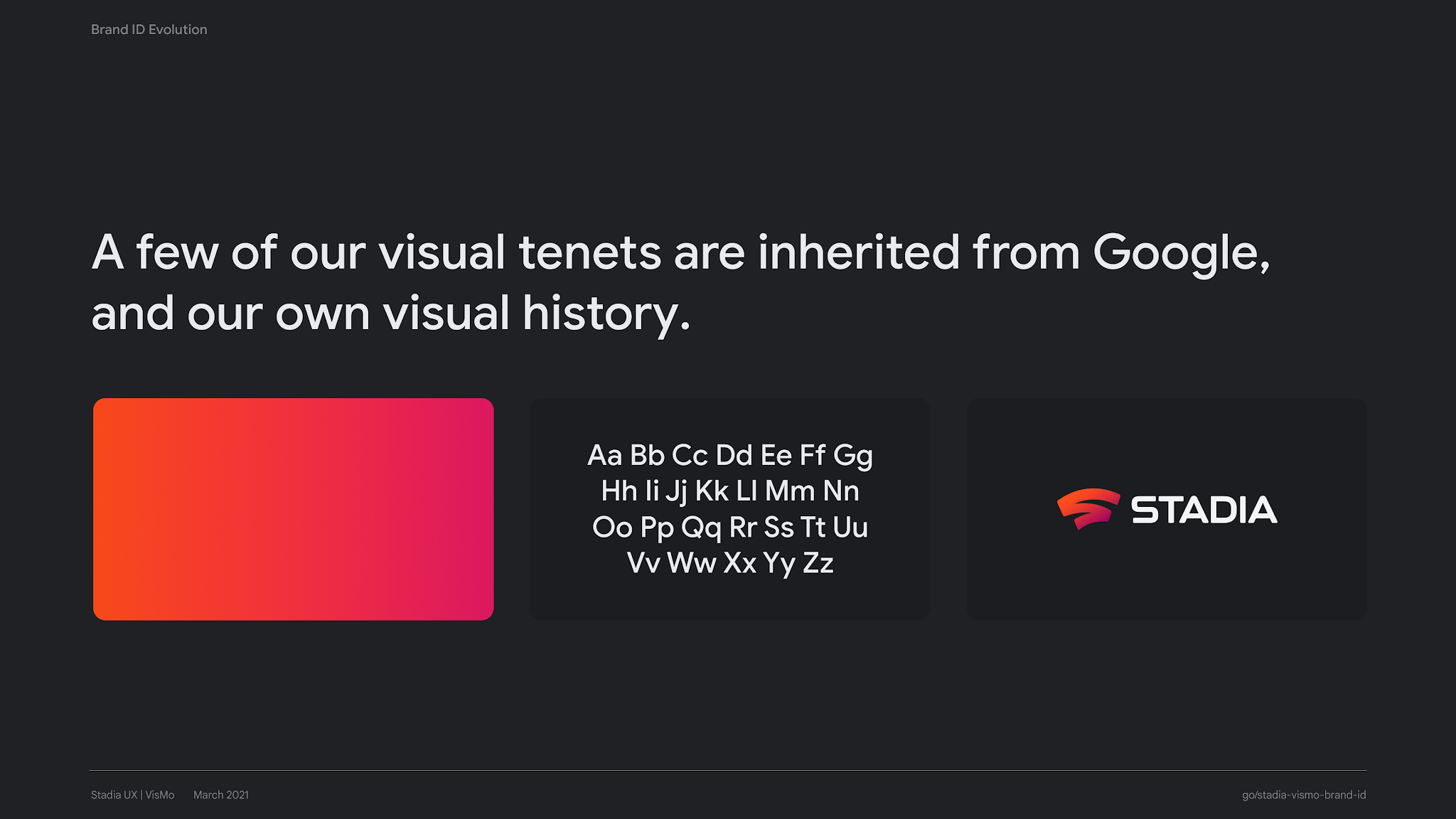
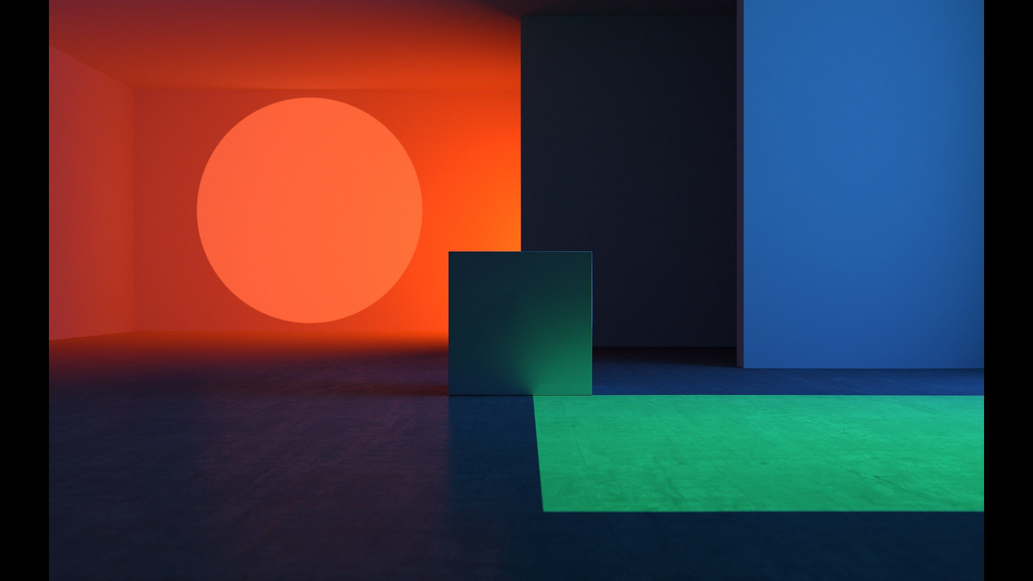
Originally adapted from Google Material, Stadia’s design language needed to evolve to appeal to a gamer audience. While GM is rooted in authenticity, clarity, and accessibility (core tenets of Google’s brand), it lacked the visual expressiveness and feeling of immersiveness needed for a gaming platform. This workstream culminated in an internal executive presentation to Stadia’s leadership teams (snapshot shown below), and resulted in cross-functional efforts across product, design, engineering, and marketing to overhaul Stadia’s design language.


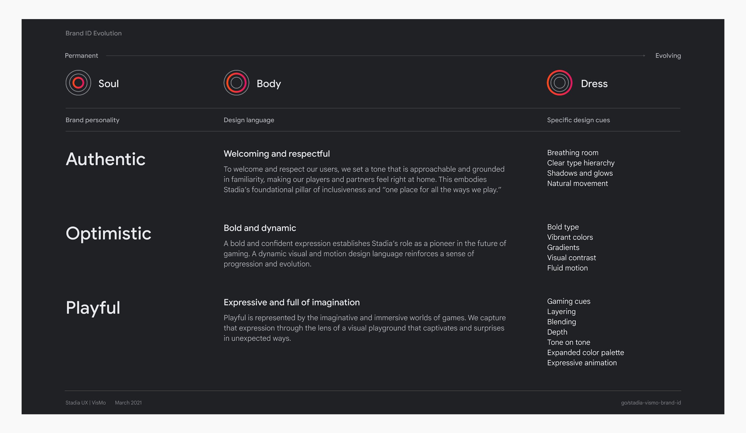
Brand identity framework outlining how brand pillars translate to design language
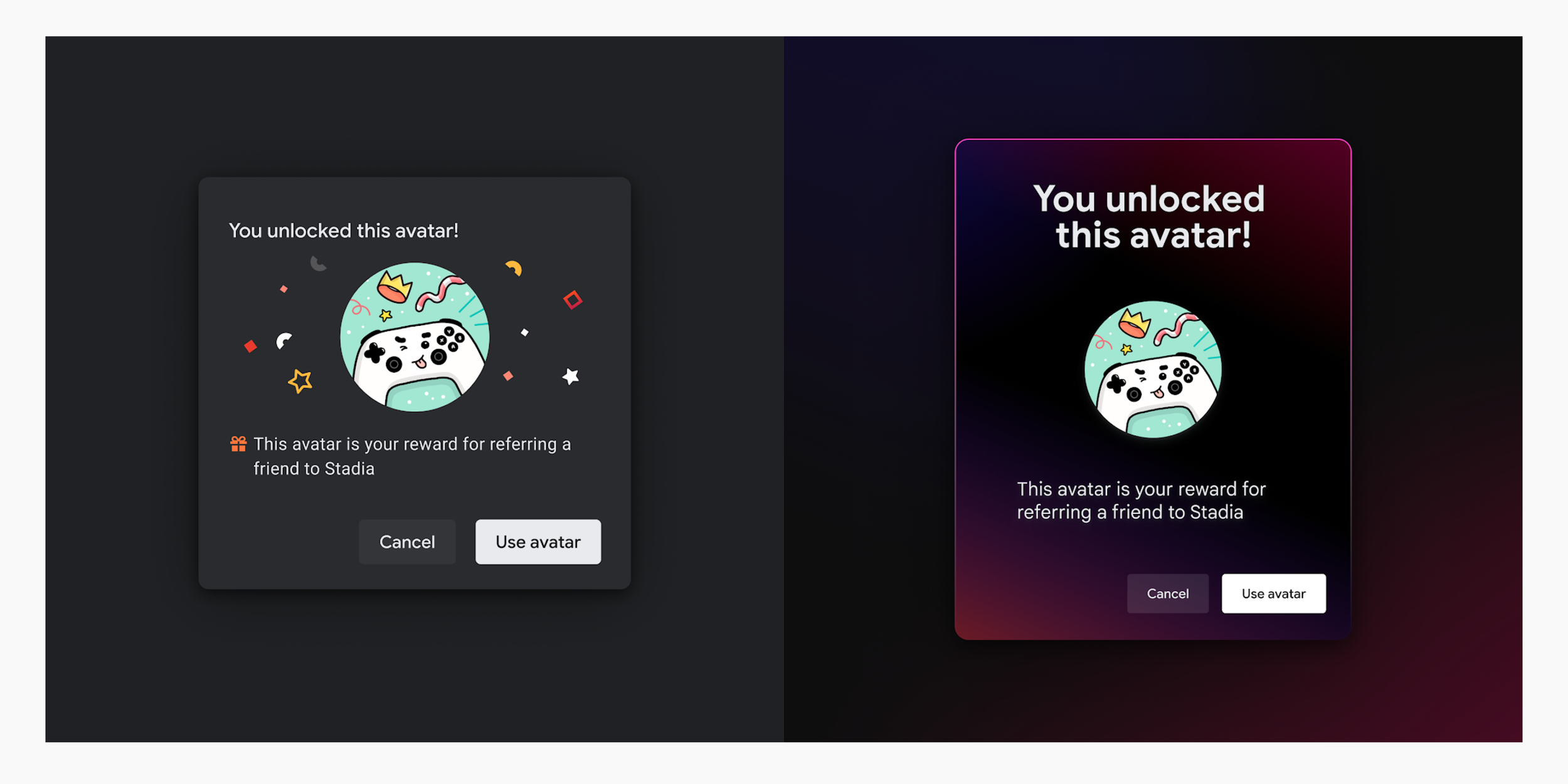
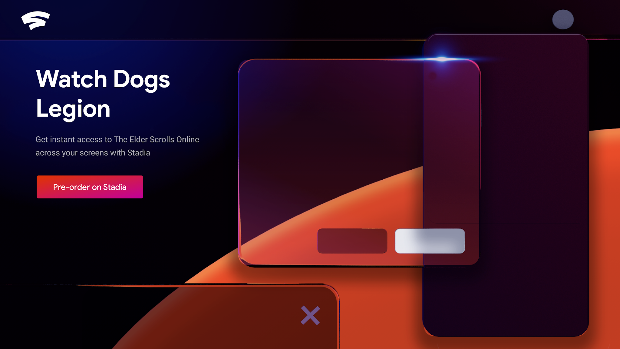
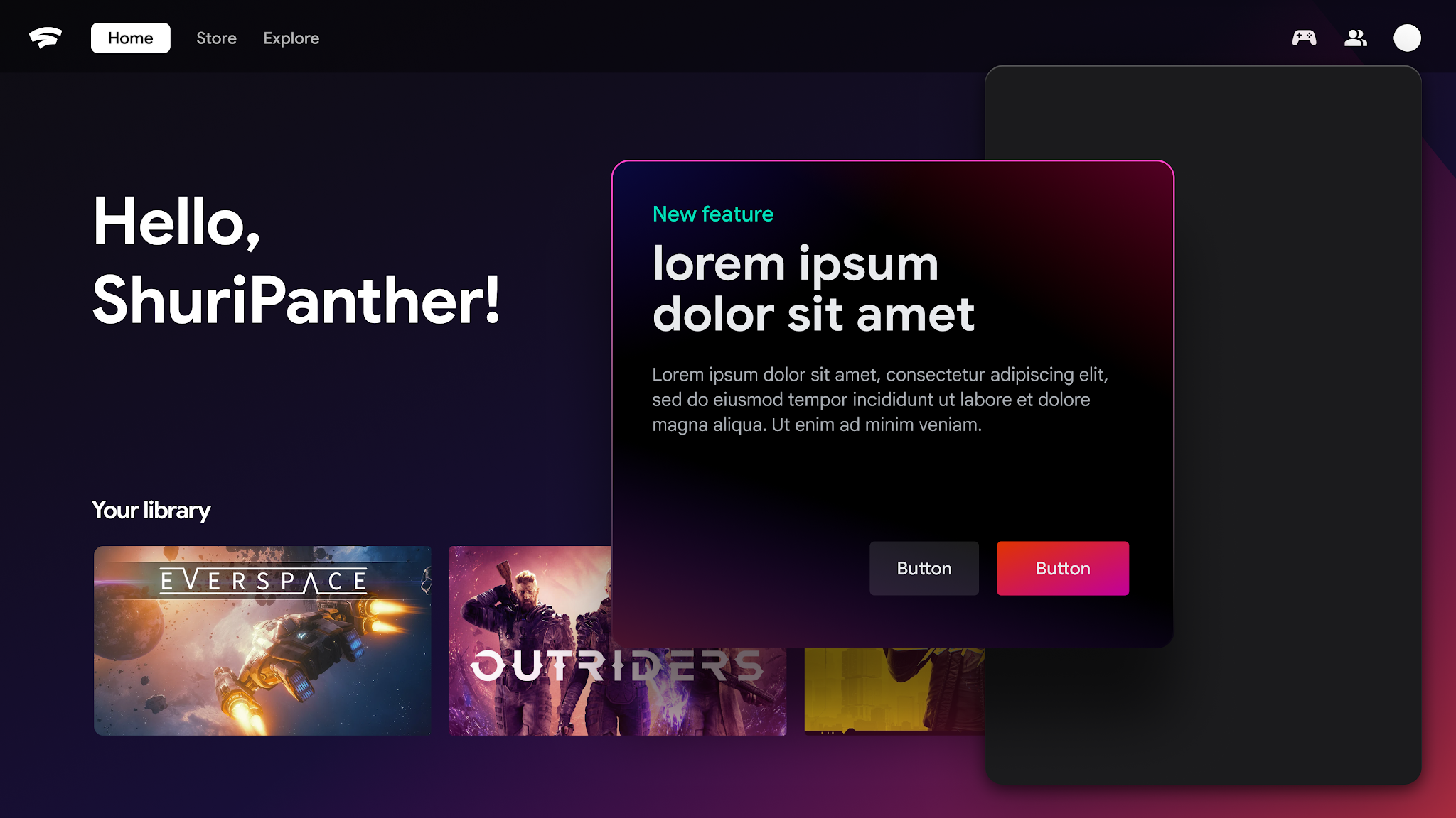
Conceptual exploration, before and after
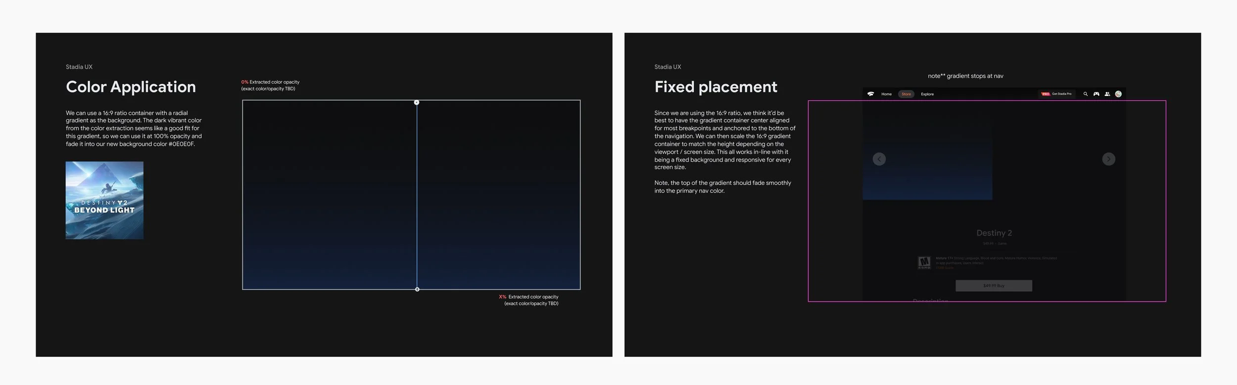
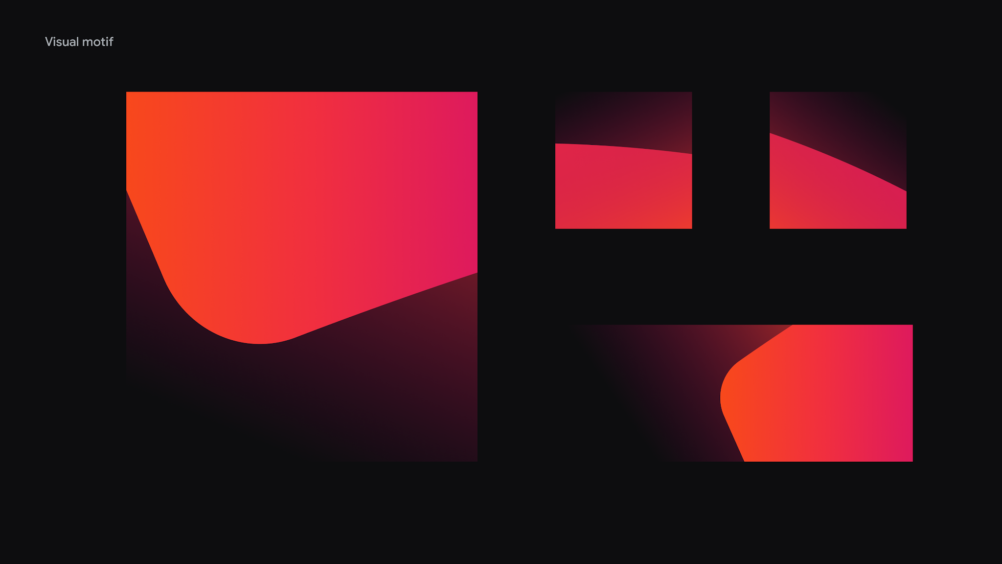
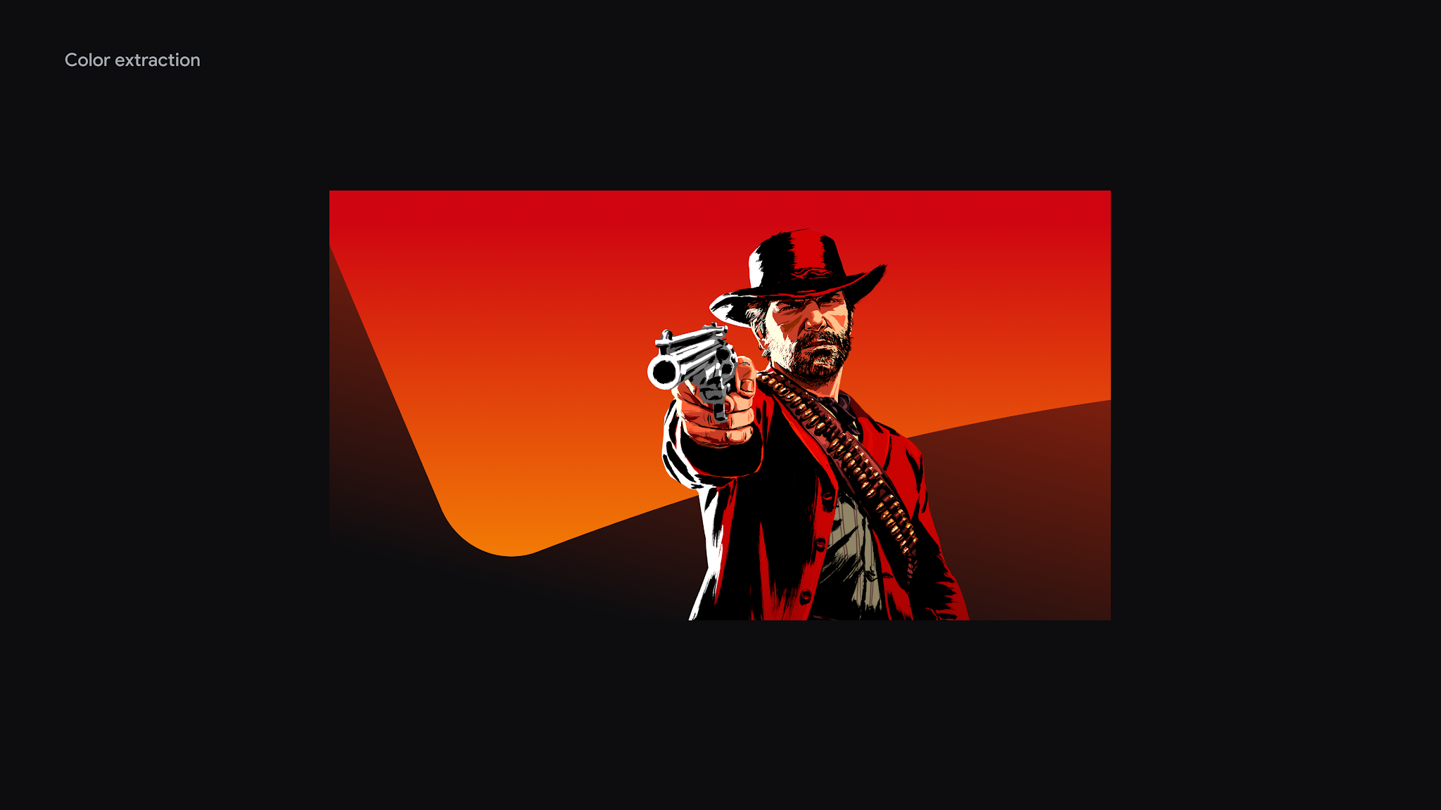
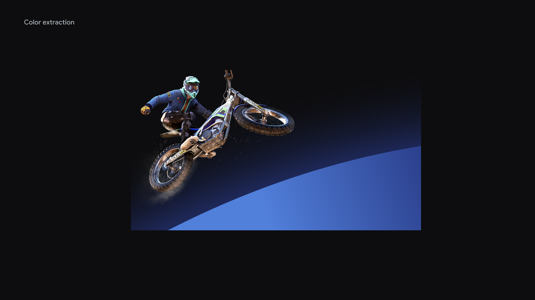
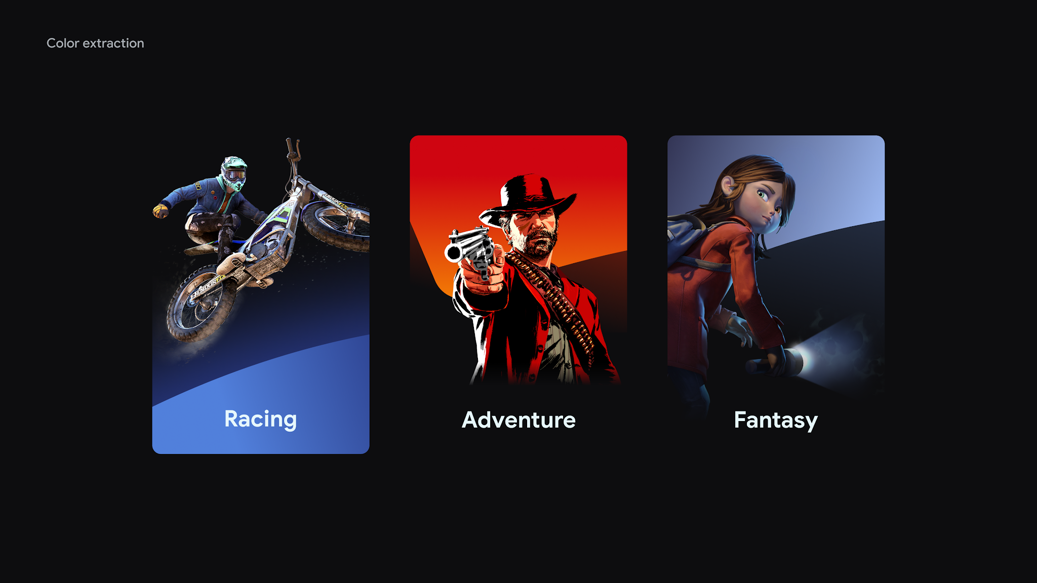
Figma explorations: testing dynamic backgrounds with color extraction
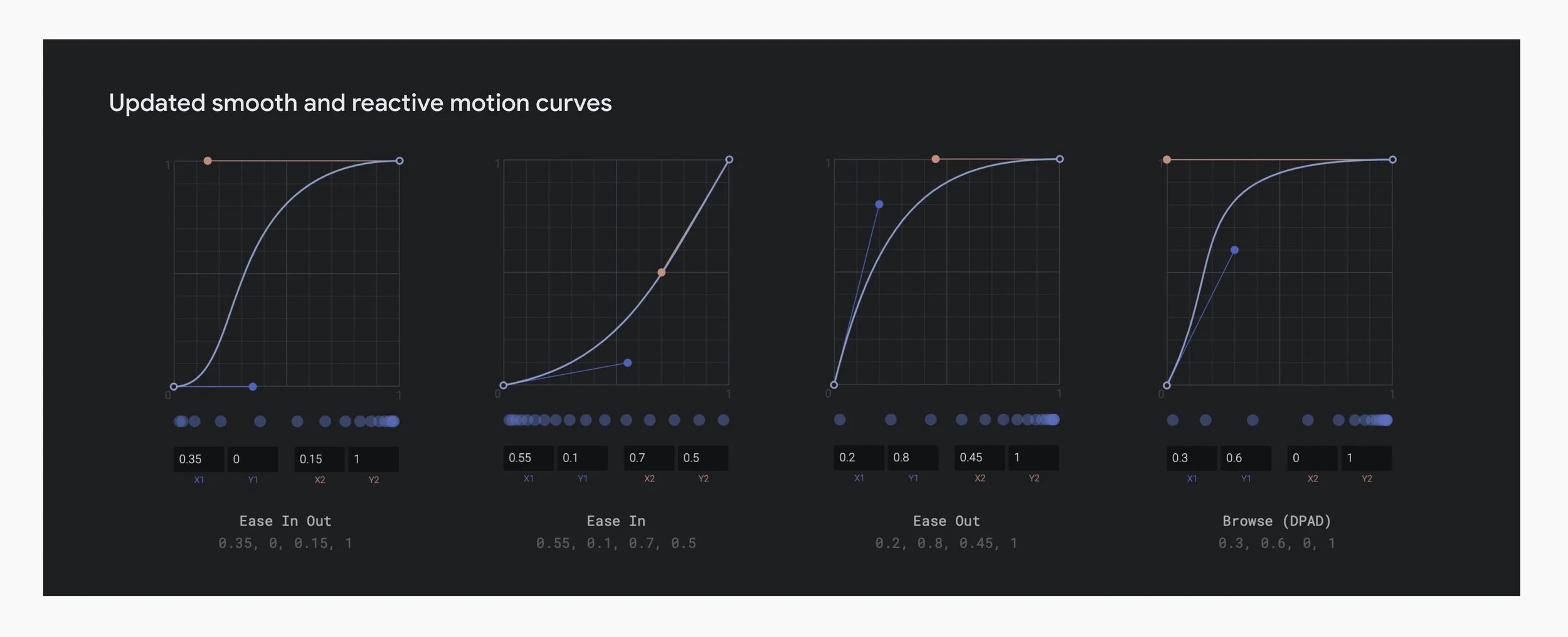
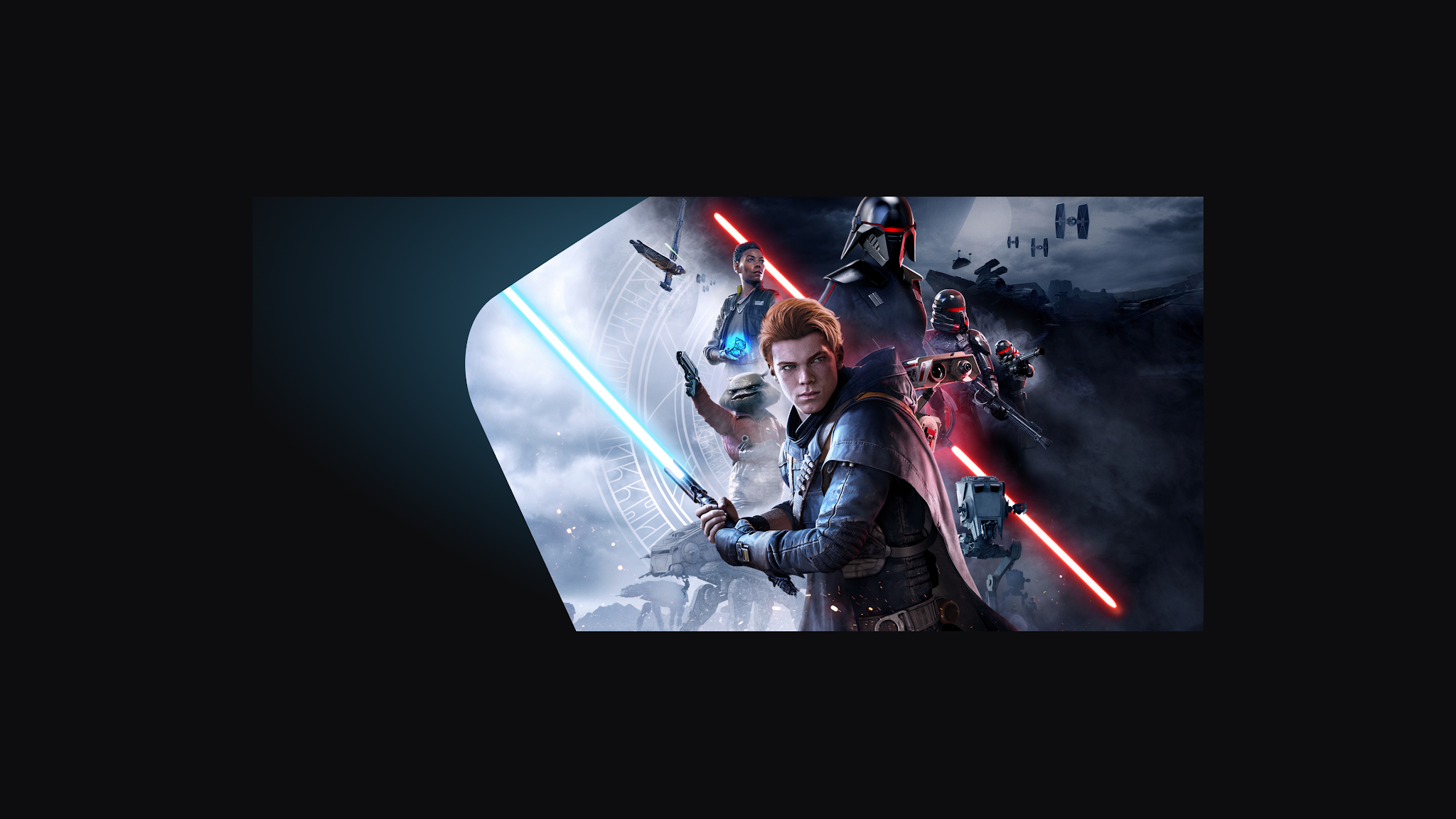
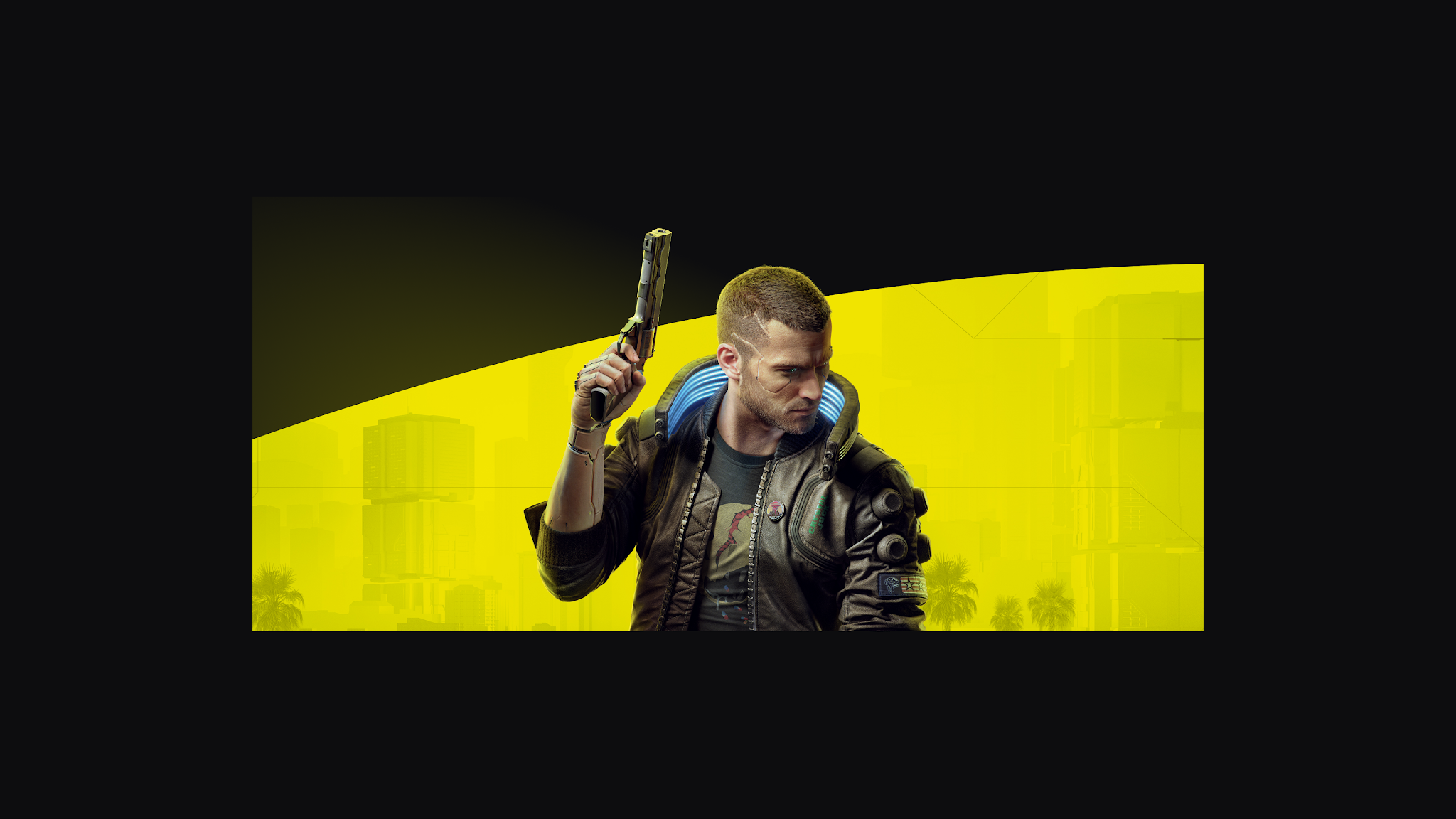
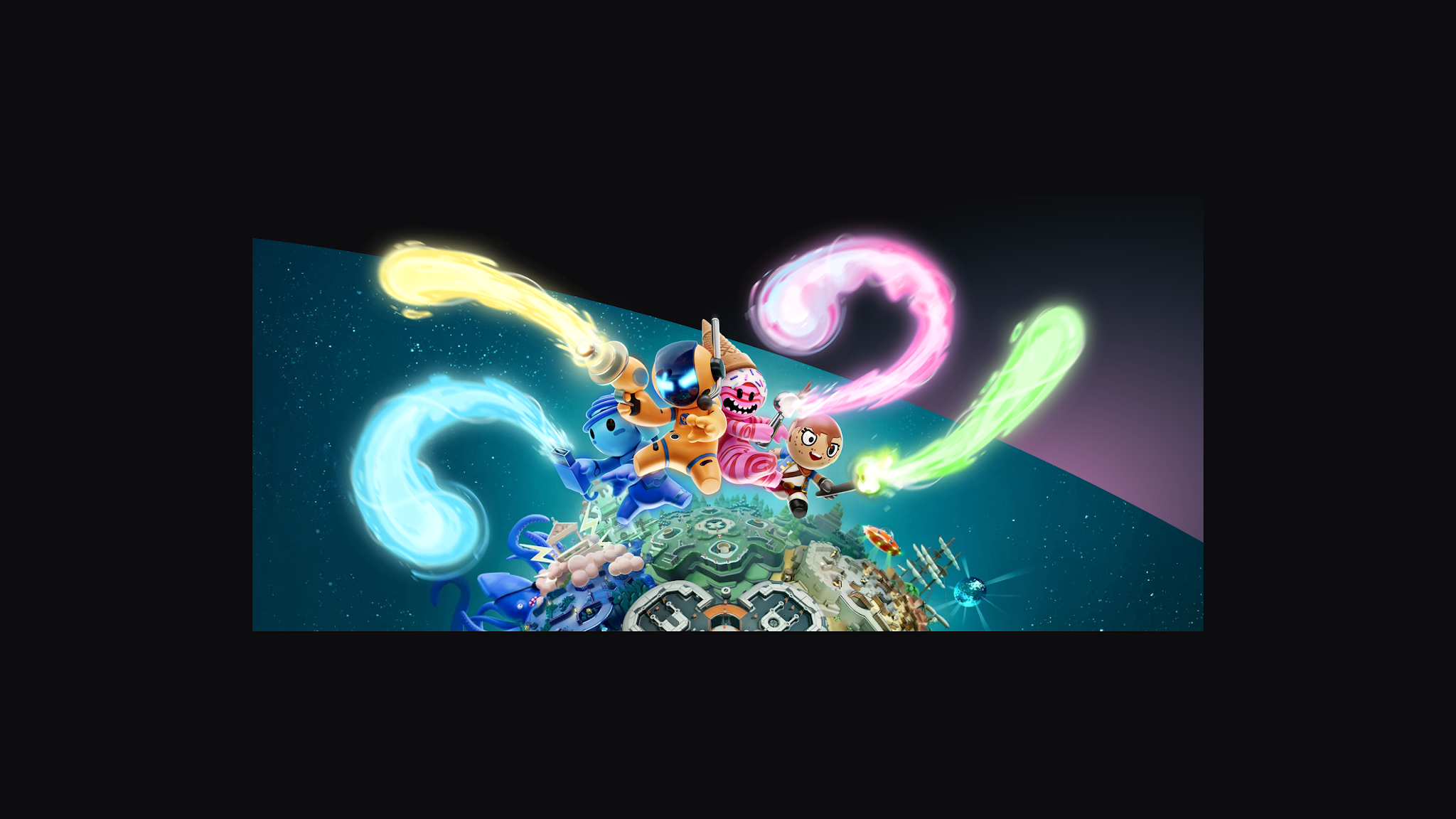
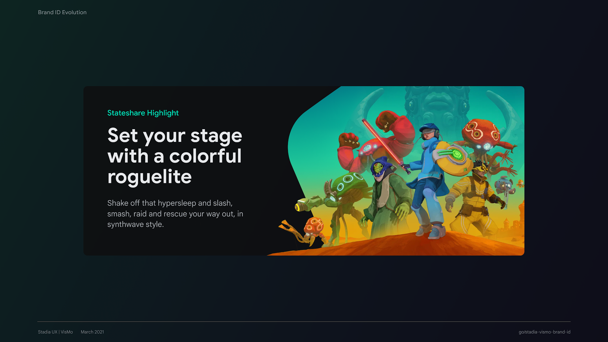
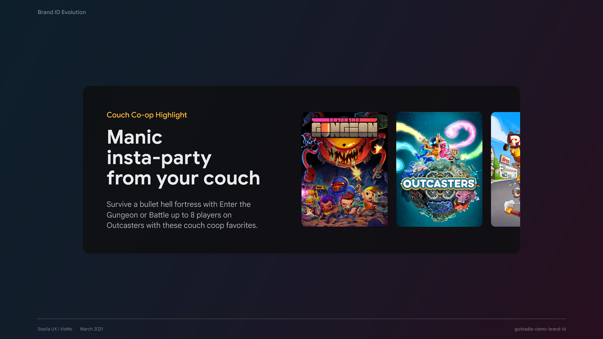
Our new brand identity framework allowed us to quickly experiment with new design elements such as reimagined color palettes, illustrations, typography, depth, and motion through rapid prototyping with a dedicated team of UX engineers. Ultimately, after a period of design iterations and feedback, we incorporated these updates into our design system resulting in Stadia's first major design overhaul across key experiences including the home screen, library, and store. We were met with overwhelmingly positive sentiment from Stadia users.

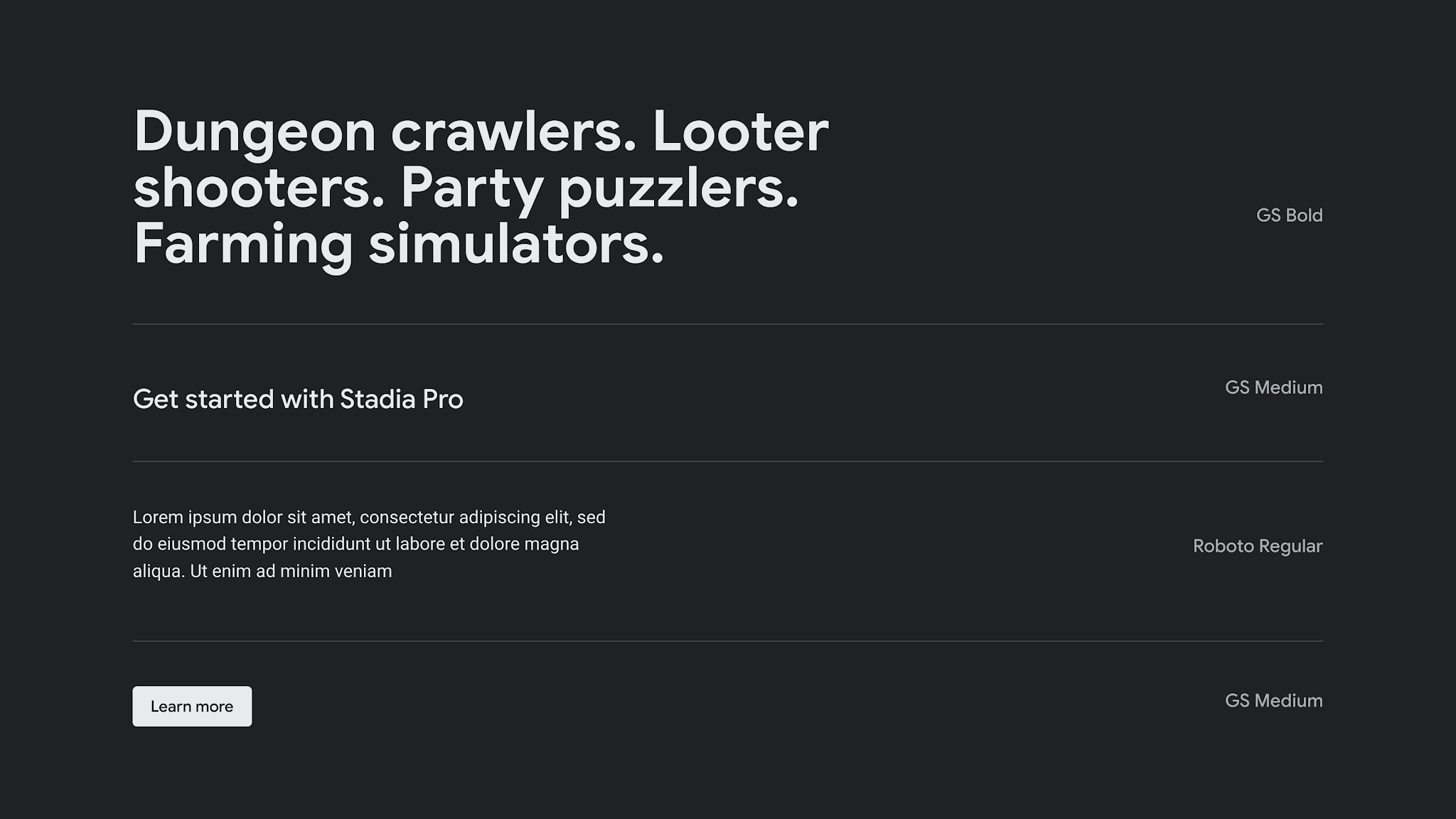
Updated visual design language including typography, expanded color palette, depth, and illustration.
Illustrations by Jaime Chong.